Blind box like Pop Mart aren’t just cute little toys. They’re an emotional experience — built with the same mechanics used in mobile games, gambling, and psychological experiments. It’s not irrational. It’s by design.
Read More

Blind box like Pop Mart aren’t just cute little toys. They’re an emotional experience — built with the same mechanics used in mobile games, gambling, and psychological experiments. It’s not irrational. It’s by design.
Read More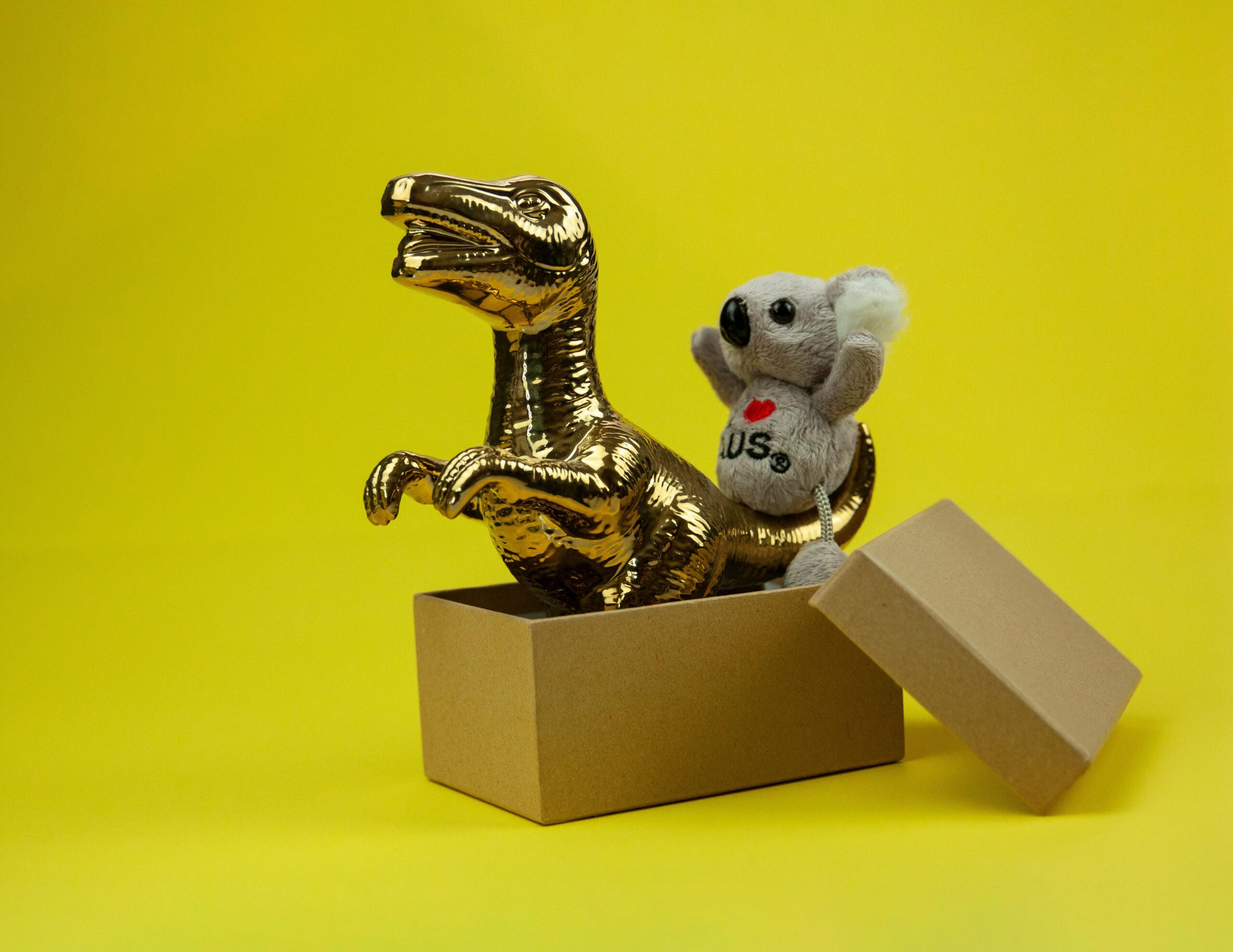
This article explores how gamified promotional features in shopping and social commerce apps are strategically designed to trigger flow experience and encourage impulsive buying. Backed by academic research, it reveals how UX design, psychology, and marketing intersect in digital product strategies.
Read More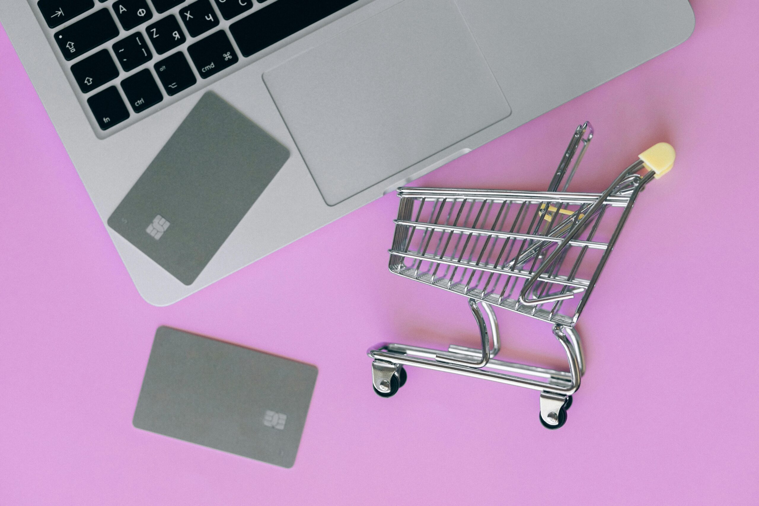
This post shares how I transformed that rough sketch into a clean, intuitive, and user-friendly TOTP verification UI—all while ensuring the experience was smooth for both developers and end users.
Read More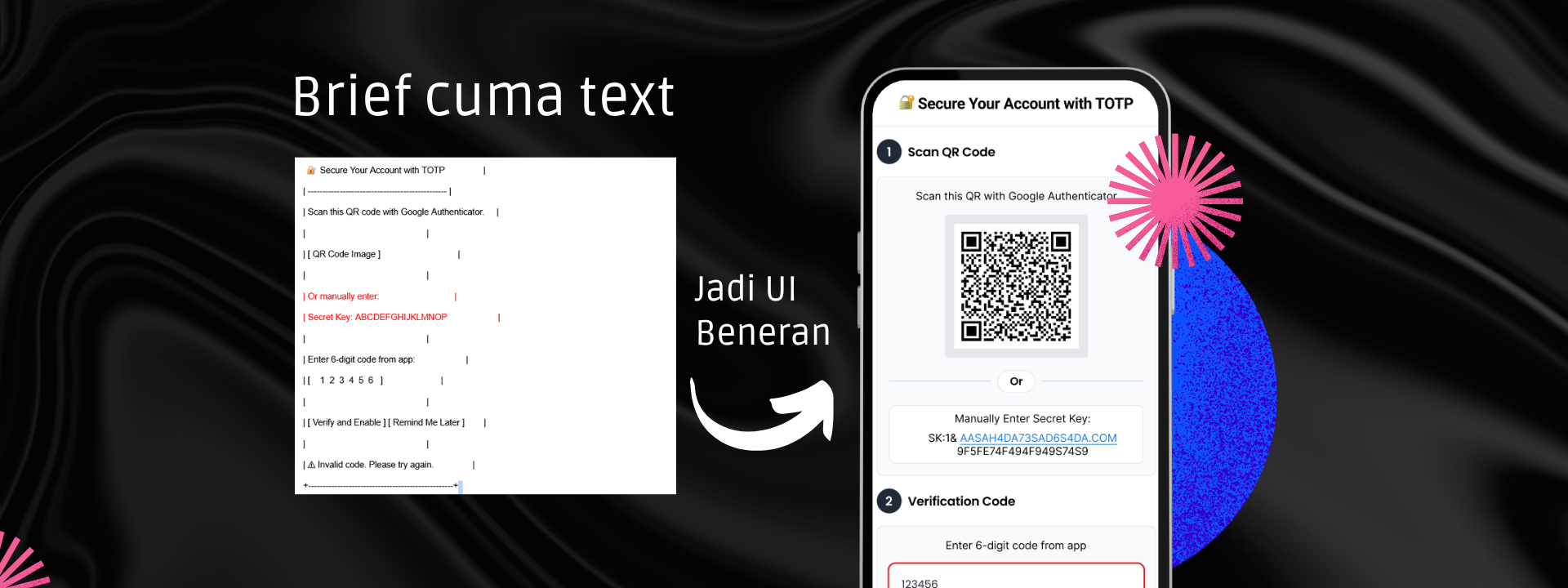
As a UI/UX designer, I once hit a creative block right before a tight deadline. Endless scrolling through Pinterest and Dribbble didn’t help. In this article, I share how I broke through that stuck moment—not by chasing more inspiration, but by returning to design fundamentals.
Read More
When Apple revealed its new Liquid Glass UI design during the latest iOS update, designers all over the world had one reaction: mixed feelings.
Read More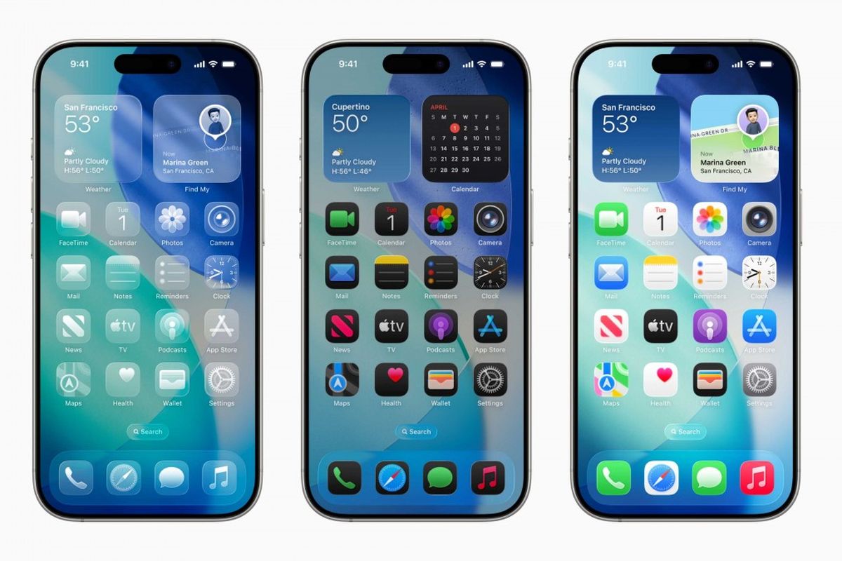
Your brand is more than a logo, it’s a visual handshake.
I craft minimalist identities that speak volumes through deliberate whitespace, timeless typography, and strategic color palettes. Through collaborative moodboarding and 2 rounds of refinements, I ensure your logo and brand system aren’t just beautiful, but adaptable across every touchpoint. Because in a noisy world, quiet confidence stands out.
“Simplicity isn’t empty – it’s where clarity meets creativity.”
