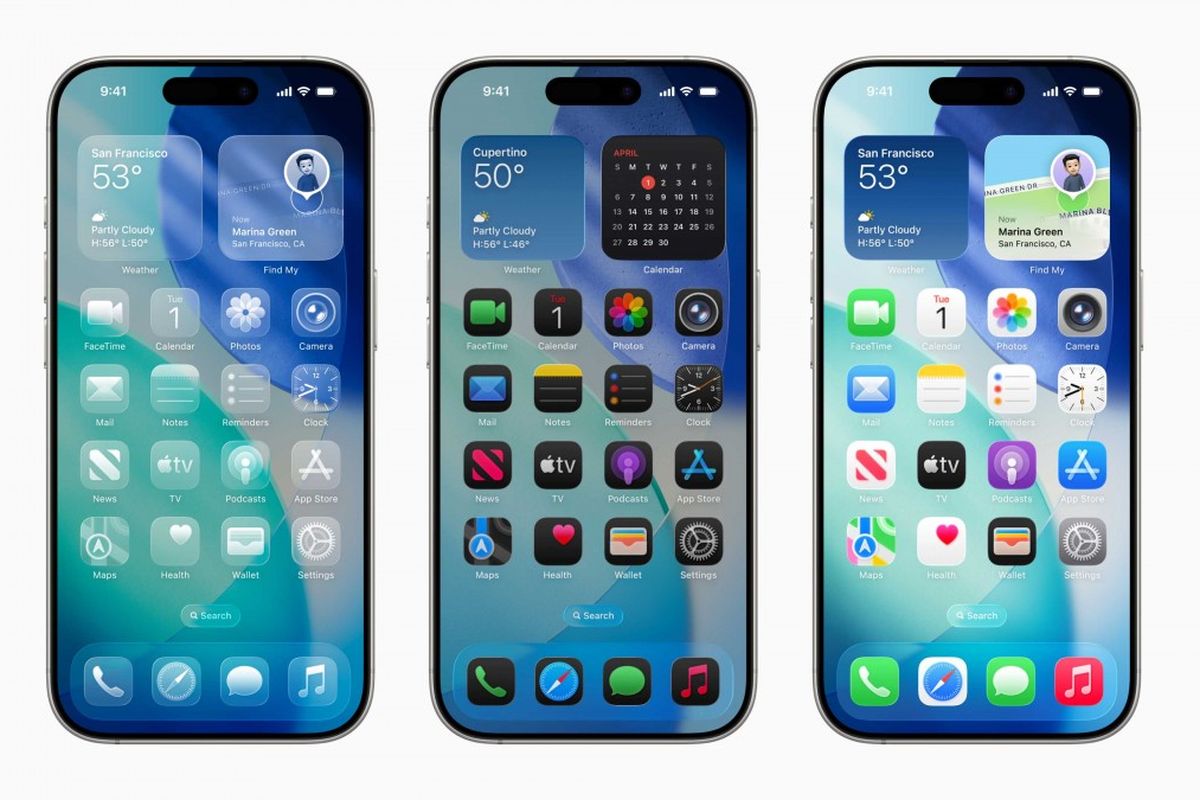
When Apple revealed its new Liquid Glass UI design during the latest iOS update, designers all over the world had one reaction: mixed feelings.
With reflective surfaces, enhanced transparency, and a glassy, futuristic look, the new visual direction was undeniably stunning. But was it user-friendly? Not really.
❗Why Did It Spark Criticism?
Many UI/UX designers called out Apple for prioritizing looks over experience. Here’s what they noticed:
Low contrast made text hard to read
Buttons and components looked too decorative, not functional
Visually distracting effects
Poor accessibility for users with visual or cognitive challenges
And the backlash wasn’t small. It was big enough that Apple made adjustments in the beta version soon after.
💡 Key Takeaways for Designers
1. Good Design = Functional First
Visuals matter, but if people can’t use it comfortably, it fails as design.
2. Always Validate with Users
No matter how polished it looks, test it. Real feedback beats assumptions.
3. Accessibility Isn’t Optional
Your design should work for everyone—not just people with perfect vision and lighting.
4. Design is Iterative
Even Apple revises their work based on criticism. So should we. That’s not a weakness, it’s the process.
🧠 Bonus Insight: Designers Have a Voice
What’s amazing is that this change was driven by designers speaking up.
From Twitter threads to blog posts and open critiques, designers shaped how Apple responded.
Your voice matters. Use it wisely. 💬
✍️ Final Thoughts
Design trends come and go. But usability and accessibility stay timeless.
It’s great to experiment, to push the limits, but always with the user in mind.
The Liquid Glass controversy wasn’t just a tech news flash.
It was a real-time lesson about what happens when form outshines function.
So next time you chase the next visual trend, ask yourself:
Will this look good and feel good to use?