
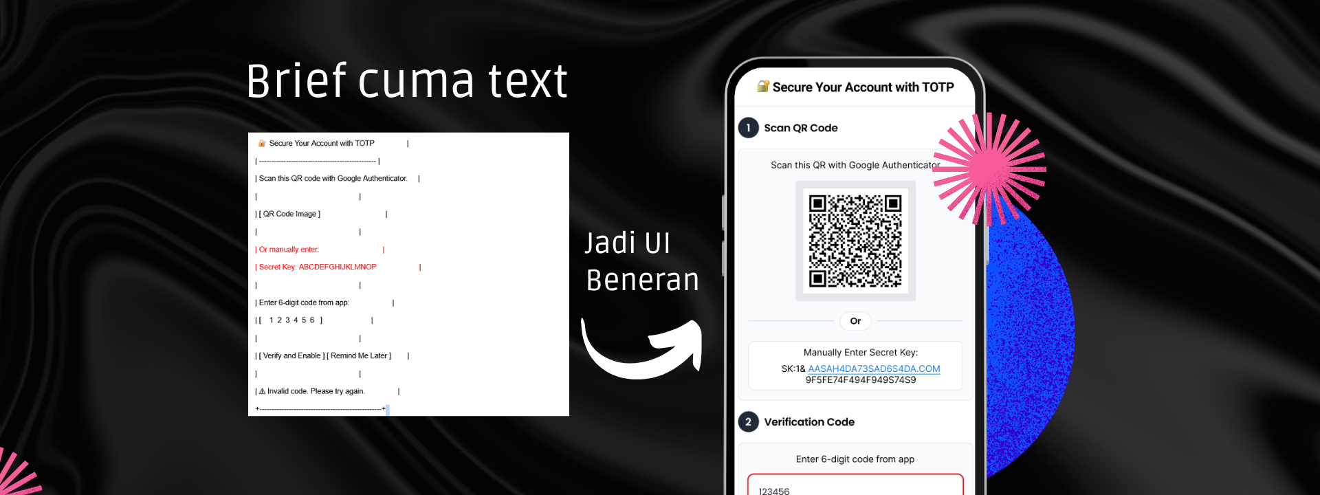
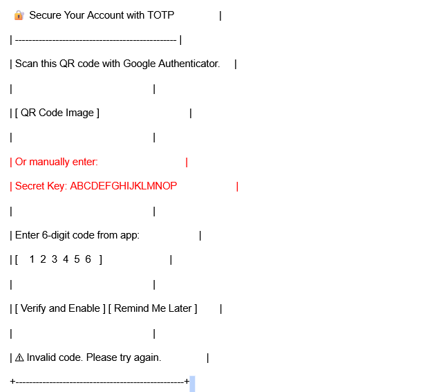
When the development team handed me a “wireframe,” it was nothing more than a plain ASCII sketch. Just text boxes saying things like [ QR Code Image ] and [ 1 2 3 4 5 6 ]. That was the entire brief.
This post shares how I transformed that rough sketch into a clean, intuitive, and user-friendly TOTP verification UI, all while ensuring the experience was smooth for both developers and end users.
The goal was simple:
Create a popup UI for TOTP (Time-based One-Time Password) setup that included:
But the challenge wasn’t in the components—it was in the user flow. With no visual hierarchy or clear structure, the original idea risked overwhelming users or causing confusion.
To address the challenge, I set the following UX goals:
✅ Guide users step by step, instead of showing everything at once
✅ Provide fallback options (manual key entry) without distracting the main flow
✅ Deliver helpful error feedback when the OTP is wrong
✅ Keep the interface lightweight and clean
Here’s how I broke it down:
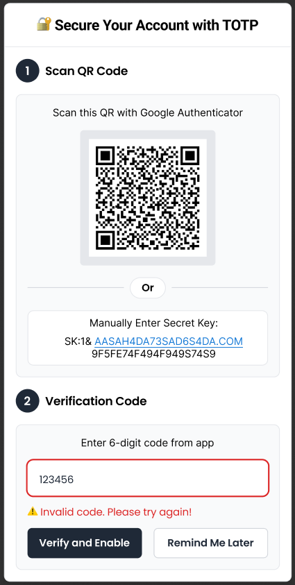
I divided the popup into two visual sections:
Step 1: Scan QR Code or manually enter the secret key
Step 2: Enter the 6-digit code generated by the authenticator app
This structure helps users focus on one task at a time.
Each section was clearly labeled and visually separated. I used number icons (“1”, “2”) for intuitive flow, added spacing, and used card-style UI elements to avoid clutter.
Instead of vague or intimidating alerts, I used a friendly message:
⚠️ “Invalid code. Please try again!”
Red input borders and warning icons make the issue obvious without being harsh.
The “Remind Me Later” button is visible but styled less prominently than the primary “Verify and Enable” CTA. This helps users understand the ideal path without forcing it.
The final design balances functionality with clarity—exactly what the dev team needed.
👉 The design was integrated smoothly by the developers
👉 Users intuitively understood the process without extra instructions
👉 The flow avoided common pitfalls like stacked actions and confusing fallback paths
This project reminded me that even the simplest sketches like an ASCII wireframe can spark thoughtful design decisions. It’s not about how detailed the brief is; it’s about translating logic into empathy through UI.
Whether you’re working with devs or designing a secure authentication flow, always ask: “What would make this easier for the user?”
Your brand is more than a logo, it’s a visual handshake.
I craft minimalist identities that speak volumes through deliberate whitespace, timeless typography, and strategic color palettes. Through collaborative moodboarding and 2 rounds of refinements, I ensure your logo and brand system aren’t just beautiful, but adaptable across every touchpoint. Because in a noisy world, quiet confidence stands out.
“Simplicity isn’t empty – it’s where clarity meets creativity.”
